Creating Reusable Bootstrap Elements With Laravel's Make:Component

Bootstrap is a good system for getting an application’s layout started and it comes with lots of helpful user interface elements that we can use in our application. The downside, is there tends to be a lot of duplication in our source code to support these elements. Thankfully, Laravel added components in the 7.x branch which will allow us to reduce that duplication.
The Problem
Let’s start by looking at how we can use the Bootstrap modal component in an example application as this will be our example for most of this article.
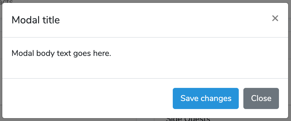
First, we’re going to add the following HTML to our resources/views/home.blade.php file. We’re going to use the home.blade.php file because every application starts with this file so it’s a nice place to test our work. This markup is essentially the example from https://getbootstrap.com/docs/4.0/components/modal/#modal-components.
<div class="modal" tabindex="-1" role="dialog" id="modelId">
<div class="modal-dialog" role="document">
<div class="modal-content">
<div class="modal-header">
<h5 class="modal-title">Modal title</h5>
<button type="button" class="close" data-dismiss="modal" aria-label="Close">
<span aria-hidden="true">×</span>
</button>
</div>
<div class="modal-body">
<p>Modal body text goes here.</p>
</div>
<div class="modal-footer">
<button type="button" class="btn btn-primary">Save changes</button>
<button type="button" class="btn btn-secondary" data-dismiss="modal">Close</button>
</div>
</div>
</div>
</div>Then in resources/js/app.js, we’re going to add the following so our modal shows up automatically when we load the page. This won’t work in production but it’s a good way to test our changes as we progress through this process.
$(function(){
    $('.modal').modal();
});
Then when we load /home we’ll see the following:
The annoying thing about using the Bootstrap modal is that to add another modal like this we’ll need to copy and paste that whole chunk of HTML every time it’s needed. Then if we ever need to update the markup we’ll have to hunt down all the modals and update their HTML individually.
Thankfully, we can do better.
Creating Our First Component
To solve this problem we’re going to use Laravel’s component feature. A component allows us to create a class (and an optional blade file) that let us define a custom HTML element that will then be replaced at runtime with our markup.
First, let’s look at the help page for the make:component command:
vagrant@ubuntu-xenial:/var/www$ php artisan make:component --help
Description:
  Create a new view component class

Usage:
  make:component [options] [--] <name>

Arguments:
  name                  The name of the class

Options:
      --force           Create the class even if the component already exists
      --inline          Create a component that renders an inline view
  -h, --help            Display this help message
  -q, --quiet           Do not output any message
  -V, --version         Display this application version
      --ansi            Force ANSI output
      --no-ansi         Disable ANSI output
  -n, --no-interaction  Do not ask any interactive question
      --env[=ENV]       The environment the command should run under
  -v|vv|vvv, --verbose  Increase the verbosity of messages: 1 for normal output, 2 for more verbose output and 3 for debug
Most of these are standard options that exist in all the artisan commands but the important thing about make:component is that we need to give our component a name. We’ll run the command like so.
vagrant@ubuntu-xenial:/var/www$ php artisan make:component Modal
Component created successfully.
This is going to create two files. The first file is app/View/Components/Modal.php and it will look like the following.
<?php

namespace App\View\Components;

use Illuminate\View\Component;

class Modal extends Component
{
    /**
     * Create a new component instance.
     *
     * @return void
     */
    public function __construct()
    {
        //
    }

    /**
     * Get the view / contents that represent the component.
     *
     * @return \Illuminate\View\View|string
     */
    public function render()
    {
        return view('components.modal');
    }
}
There isn’t much in this class but the thing to note is that the render() function is using the view() helper function to render the contents of resources/views/components/modal.blade.php. When we open resources/views/components/modal.blade.php it will contain the following HTML.
<div>
<!-- He who is contented is rich. - Laozi -->
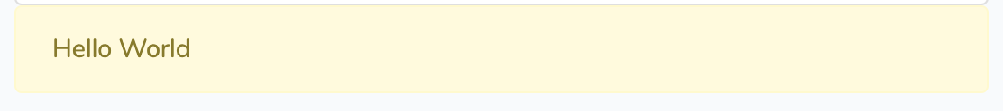
</div>As a quick check to make sure everything’s working lets put the markup for an alert in the file so we can see how this will work without having to handle the “complex” markup of the modal.
<div class="alert alert-warning" role="alert">
    Hello World
</div>
Now in resources/views/home.blade.php we’re going to add the following.
<x-modal></x-modal>The x- indicates this is a component and the modal indicates which class to use.
When we refresh we’ll see our alert.
Getting the Modal Working
To get started on our journey of making a reusable modal we’re first going to remove the modal markup we added to resources/views/home.blade.php and we’re going to paste it in resources/views/components/modal.blade.php.
<div class="modal" tabindex="-1" role="dialog" id="modelId">
<div class="modal-dialog" role="document">
<div class="modal-content">
<div class="modal-header">
<h5 class="modal-title">Modal title</h5>
<button type="button" class="close" data-dismiss="modal" aria-label="Close">
<span aria-hidden="true">×</span>
</button>
</div>
<div class="modal-body">
<p>Modal body text goes here.</p>
</div>
<div class="modal-footer">
<button type="button" class="btn btn-primary">Save changes</button>
<button type="button" class="btn btn-secondary" data-dismiss="modal">Close</button>
</div>
</div>
</div>
</div>We already have our x-modal in resources/views/home.blade.php so when we refresh the page we’ll get our modal again.
Working With $slot
Now we have a modal we can easily reuse anywhere in our site but they’re all going to say “Modal body text goes here.” which isn’t helpful to us in the long run. Thankfully, the components model allows us to easily add a section to resources/views/components/modal.blade.php that will allow us to replace a specific piece of the code.
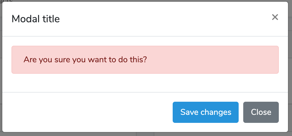
For example, let’s say we want to add an alert inside the modal. We can do this in resources/views/home.blade.php.
<x-modal>
    <div class="alert alert-danger" role="alert">
        Are you sure you want to do this?
    </div>
</x-modal>
Then in resources/views/components/modal.blade.php, we’re going to replace the section where we had the body of the modal with {{ $slot }}. The $slot variable will be where Laravel injects the HTML elements inside of the x-modal element we created above.
<div class="modal" tabindex="-1" role="dialog" id="modelId">
<div class="modal-dialog" role="document">
<div class="modal-content">
<div class="modal-header">
<h5 class="modal-title">Modal title</h5>
<button type="button" class="close" data-dismiss="modal" aria-label="Close">
<span aria-hidden="true">×</span>
</button>
</div>
<div class="modal-body">
{{ $slot }}
</div>
<div class="modal-footer">
<button type="button" class="btn btn-primary">Save changes</button>
<button type="button" class="btn btn-secondary" data-dismiss="modal">Close</button>
</div>
</div>
</div>
</div>Here’s our example:
As a quick aside, it should be noted that we’re using {{ }} and not {!! !!} but the HTML is still “correct” (without escaping the control characters).
Variables
Using {{ $slot }} is great but what if we have more than one section we need to replace?
Let’s look at the title for example.
<h5 class="modal-title">Modal title</h5>The components logic allows you to pass variables as an attribute to our custom element.
<x-modal :title="Custom Title">
    <div class="alert alert-danger" role="alert">
        Are you sure you want to do this?
    </div>
</x-modal>
To access this in our blade file we need to add it as a parameter to our constructor and make it a public attribute of the class.
public $title = '';
public function __construct($title)
{
    $this->title = $title;
}
Now we can use it as a variable in our blade view.
<h5 class="modal-title">{{ $title }}</h5>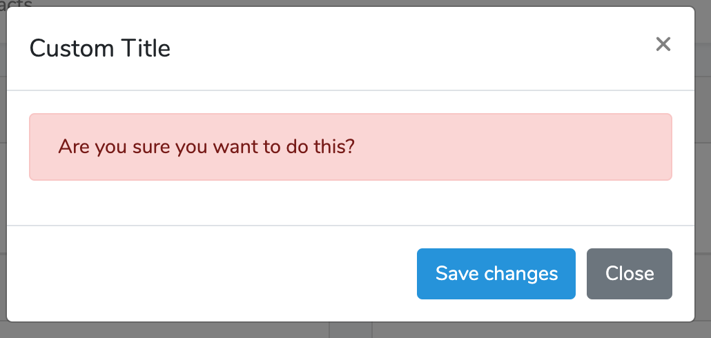
Custom Functions
Let’s look at one of the last pieces of information we might want to replace. The id attribute of the modal.
<div class="modal" tabindex="-1" role="dialog" id="modelId">In this example, we’re going to want to have a fallback if the id isn’t specified as an attribute.
There are two ways we can handle this. The first is that the component provides a variable $attributes that contains all the attributes passed to the component so we can use it to get the value or substitute our own but that puts logic into our view file which is always ripe for problems.
The other solution is to create a function that will contain the logic for this. The first step is to capture any id value that is passed to the component.
public $title = '';
public $id = '';
public function __construct($title, $id = '')
{
    $this->title = $title;
    $this->id = $id;
}
Now inside our resources/views/components/modal.blade.php file, we’ll get the value using a function like so.
<div class="modal" tabindex="-1" role="dialog" id="{{ $getModelIdString() }}">Note that the function starts with a $.
Now in our Modal class we can write the getModelIdString() function to perform the logic for us.
public function getModelIdString(): string
{
    if ($this->id != '') {
        return $this->id;
    }

    return "model" . rand(1111, 9999);
}
No Blade File
From our output of the help page for make:component above we can see there’s an --inline option. This option causes the class to be created but not the corresponding blade file. This can be helpful when the component only outputs a small amount of HTML. In general, we recommend never putting HTML inside a class because it causes all kinds of formatting and maintenance problems but we’re going to allow it for our example.
Let’s look at the alert we have inside our modal.
<x-modal title="Custom Title" id="customModal">
    <div class="alert alert-danger" role="alert">
        Are you sure you want to do this?
    </div>
</x-modal>
This is another case where we might have the same UI element repeated over and over again in our application so it’s a good candidate for turning it into a component. For our example, we’ll use the --inline argument.
vagrant@ubuntu-xenial:/var/www$ php artisan make:component --inline AlertDanger
Component created successfully.
Let’s look at our newly created app/View/Components/AlertDanger.php.
<?php

namespace App\View\Components;

use Illuminate\View\Component;

class AlertDanger extends Component
{
    /**
     * Create a new component instance.
     *
     * @return void
     */
    public function __construct()
    {
        //
    }

    /**
     * Get the view / contents that represent the component.
     *
     * @return \Illuminate\View\View|string
     */
    public function render()
    {
        return <<<'blade'
<div>
    Smile, breathe, and go slowly. - Thich Nhat Hanh
</div>
blade;
    }
}
In this class the render() function doesn’t use the view() helper and instead returns a string containing the element. We can then add the alert markup to the render() function.
public function render()
{
    return <<<'blade'
<div class="alert alert-danger" role="alert">
{{ $slot }}
</div>
blade;
}
Finally, we can use the new x-alert-danger element in our modal.
<x-modal title="Custom Title" id="customModal">
    <x-alert-danger>
        Are you sure you want to do this?
    </x-alert-danger>
</x-modal>
Conclusion
The Laravel component can be used to reduce duplication in our markup by allowing us to abstract out our most used and most complicated UI elements. By harnessing components we can make our code easier to maintain and read.
Hopefully, this has been as helpful to you as it has to us and check back with us soon for more artisan commands.

Scott Keck-Warren
Scott is the Director of Technology at WeCare Connect where he strives to provide solutions for his customers needs. He's the father of two and can be found most weekends working on projects around the house with his loving partner.
Top Posts
- Working With Soft Deletes in Laravel (By Example)
- Fixing CMake was unable to find a build program corresponding to "Unix Makefiles"
- Upgrading to Laravel 8.x
- Get The Count of the Number of Users in an AD Group
- Multiple Vagrant VMs in One Vagrantfile
- Fixing the "this is larger than GitHub's recommended maximum file size of 50.00 MB" error
- Changing the Directory Vagrant Stores the VMs In
- Accepting Android SDK Licenses From The OSX Command Line
- Fixing the 'Target class [config] does not exist' Error
- Using Rectangle to Manage MacOS Windows